2011
For the 2011 activites of designnova, I convinced the project leader, Mrs. Hu to do a cleaner rework of the logo and to abandon the old type-based logo. The flower logo from the original design group was kept and the type replaced by a simpler logotype, that included the chinese name Tian He Jiang in Hanzi. The new logo can also be monochrome white if it appears on a dark background.
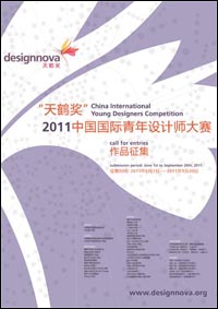
For the 2011 competition, the key visual was based on an ancient chinese star map. I found that this had a lot of possible connotations, such as people and their connections, molecular bonds and, of course stars. this idea came from the Tian (Heaven) in the chinese name and the nova in the english name.
|
|
 |
|
the 2011 competition poster
(click to enlarge)
|
|